Supporting data visualisation creation for twelve investigation projects in South-East Asia
Related project
4M Asia"Open the link to the menus on Slack, then provide details of your order on the Google Sheet spreadsheet that I have just created in the G Drive".
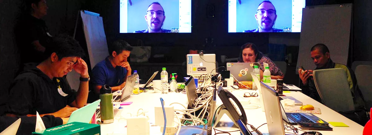
That's how, in two clicks, Keng Kuang Ser Kuek (DataN), co-trainer at the CFI data visualisation workshop, which took place in Kuala Lumpur (Malaysia) from 10 to 16 July, sorted out the lunch choices of the 12 participants.
Yet not so long ago, such references to web applications and tools were meaningless to most of these media professionals working in South-East Asia.
Now, they all handle developers' basic techniques and language codes with ease.
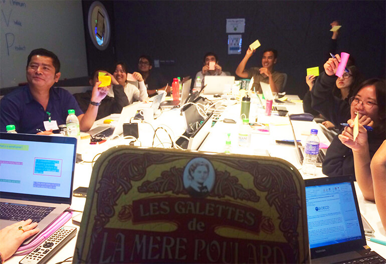
Nine men and three women, journalists flirting with activism from Cambodia, Malaysia, Burma, Vietnam, Thailand, Indonesia and the Philippines, were selected following a call for applications from CFI as part of the 4MAsia project.They are participating in a data journalism training programme designed to provide support for media projects focusing on human rights and citizens' oversight of state actions, to further promote government transparency and accountability and dialogue between the people and their elected representatives.
While their first foray into the immense possibilities offered by data began in Phnom Penh in May 2017, under the instruction of Pinkie and Marianne Bouchart, respectively the co-trainer and the principal trainer responsible for the programme's content and educational coherence, it was in Kuala Lumpur, at the office of Google Malaysia which hosted the workshop, that powerful interactive visuals were used to put data into perspective.
After a theory phase in which the participants had a chance to learn the basics of visualisation and in particular to discover its history (and the fact that this practice dates back to prehistoric times), the 12 projects selected were scrutinised in collaborative brainstorming sessions in which all the participants, guided by their trainers, shared ideas and drew up plans and outlines of infographics on Google Malaysia's whiteboard walls.
During the 5 day-long programme, Marianne and Keng taught the participants to analyse their data in order to define which type of visualisation is most appropriate for their project, and to use a number of free tools, such as HighCharts and Infogram (for graphs), Piktochart (for infographics), Tableau Public (for interactive graphs and maps), CARTO and UMap (for interactive map-making).
An entirely separate discipline that has developed alongside 'conventional' journalism, data journalism enables media professionals to go even further in their efforts to inform, using digital skills and tools to strengthen democracy in the area they cover.
Supporting citizen engagement
Beyond the primary function of informing, data journalism and infographics are inherently intended to educate the public, using interactive tools and a healthy dose of reflection on the relevance of the information disseminated, in relation to both its substance and its form. This type of format requires that a connection be created with the reader, to draw him or her into the subject, and a good data visualisation will meet the challenge of humanising data, putting faces and names to it.
In short, the aim is to tell the stories hidden behind the figures and create a connection with the audience.
The acquisition of these new skills, nowadays indispensable for any kind of journalistic writing throughout the world, will enable the programme's participants to work even more effectively and to become a focal point, allowing them, in turn, to pass on these techniques, which represent natural progression in the practice of journalism. The fact that they are part of a small team, or even the only data journalists on the staff (as is often the case in the countries in which CFI works), admittedly makes the task more burdensome; however, what might appear to be a disadvantage also brings some not insignificant benefits, as Fernando Blat, co-founder of Populate Tools, (i.e. the website for the Panama Papers, Offshore Leaks…), a site which creates data visualisation tools to support citizen engagement, stresses:
"It forces you to be very precise and specific in creating your data visualisations; it is an intensive learning process for which you must take on every role, which will leave you more self-sufficient, fast-acting and incisive".

Relevant to all media
To select which data to highlight, it is necessary to focus on the most striking information, and to consider the local context: which information will be of interest to and constitute essential knowledge for my target audience?
For example, one of the Vietnamese participants, investigating the reasons behind the very high number of accidents involving two-wheeled vehicles in his country, was advised to look more closely at his information, beyond the simple figures relating to the number of deaths: in graph form, how can the number of accidents be put into perspective with the periods during which road safety campaigns were being run, in order to confront the government with its own shortcomings?
Likewise, in relation to the investigation into deforestation in Burma, would the insertion of a counter, indicating the time remaining before the forest is completely destroyed, not reinforce the information conveyed in the article? And would the addition, in another tab entitled "What can I do?", containing up-to-date links to dedicated websites, in particular to online petitions, not enable the reader to feel more involved in this environmental issue? This is also a good way of building up a loyal audience, by offering the reader information that is useful and allows him or her to get actively involved.
This new range of possibilities for the journalistic representation of data encompasses all forms of media, even radio. All that is required is some imagination: some applications - also provided to the workshop participants - enable data to be converted into music, the rhythm giving impetus to the acceleration or slowing of a trend, such as the number of arrests over a given period, for example.
The next step for each participant will be to work on their projects over the summer, to complete their investigations and delve more deeply into their topics, expanding on their work so far.
The final workshop of the programme will take place in October in Manilla, in the Philippines, during which the participants will gain experience and learn tricks and techniques to make their topic viable online, by optimising its visibility, its interactivity, and, of course, its monetisation.

Three tips from Fernando Blaton creating an effective data visualisation
- Keep it simple: don't complicate your production process;
- Take time to fact check: verify your data sources to confirm the data is accurate and put it into perspective, instead of concentrating from the outset solely on the data visualisation
- Keep things minimalist and don't overload your visuals: it should be possible to immediately grasp the key information and the intended purpose of your data visualisation.


